The Kindle as a digital textbook (in reply to @joshchandler)

Now that the kindle is finally coming to the UK, my opinions of it are a bit more pointed.

First, I have a huge library of books The one drawback of this is that it takes up large volumes of space. So the kindle does have one major advantage for me personally. And i don’t have any problem with dead-tree printing. The downside is that none of those books are going to be on my new kindle.

Second, Josh Chandler’s post specifically highlights the use of the Kindle in collage and universities. This was a major selling point of the Kindle, and later of the Kindle DX. Being a programmer, the DX is my only option if i want it for textbooks. And the DX is expensive (if I’m only buying a few textbooks, I’m better of buying the dead-tree versions). Aside: a Zune-like subscription service would be much better.

Third, the kindle has Newspapers and blogs, plus any PDF you care to email to it. This has obvious advantages. I enjoy reading the paper every now and again. And i have a few e-books that i could see myself emailing to the kindle. Nasa, for example has a great library of Histories that are available on the web for free. Those that aren’t in PDF, I point acrobat at the address and acrobat downloads them. There’s my e-book. So again, another use I have for the kindle.

Forth. How does the Kindle handle PDF DRM on my existing e-books?? I already have a few technical books in PDF that I bought. Will i be able to use them on a Kindle??

Now the PDF standard is actually capable of far more that most people actually use it for. PDF is built for this kind of digital textbook use case. Its annotation tools, for example are second to none.

Does the kindle use this format?? No. Does it use the openPub standard that Google’s e-books are available in?? No. (as a programmer this offends me greatly). As a result, all the hype about the DX being used at Princeton etc actually has come to nought. Students rarely use it. Why?? Annotation. Remember I can WRITE, CIRCLE, HIGHLIGHT, DOODLE (and so on) on a dead-tree book.

The Kindle could do much more as a digital text book. Remember the Apple iTablet is a-coming and ,as things stand right now, given the choice between a dedicated dead-tree replacement, and a fully fledged computer/personal media player that also is a dead tree replacement and does everything the Kindle does, better, you know where I’d be going.

Coincidentally, me and my fellow students are picking honours year projects. One suggestion I made was to take the diagrams and so on from the smartBoards (they must have an API, surely), and merge them with the PDF version of the notes. (PDF has an API). Seriously, how great would that be?? Currently I draw all that stuff on my laptop (Kudos to which ever genius laid out the Ribbon in Word 2007, BTW). So what my lecturer is doing on the board magically appears on my PDF. Tie that with a kindle and you have instant student heaven/nirvana. 

If Amazon is serious about the ability of the Kindle to make a splash in the student market, these are the kinds of things it needs to be thinking about. Apple is so successful with its products because they make them indispensible. Amazon needs to do stuff like that to make the kindle indispensible for the serious student.

So it has the POTENTIAL to be the perfect digital textbook.

Will Amazon see that???

Apple v Google

Apple’s rejection out-of-hand of the Google Voice App has the interwebs all a flutter with rumours and speculation, not to mention fury as well.

Although I’m in the Uk and therefore locked out of a GV account until its released here, I’m looking forward to using it soon. Its no accident that I’m especially looking forward to using it with my iPhone, or i was in any case.

The reason why this is causing such an uproar is that the target market for GV users just happens to overlap rather significantly with that of the iPhone.

The fact is though, Google Apps for Business does not get enough attention these days. In fact, there has been a spate of articles on how Google Apps for Domain falls down when it comes to being a valid option for businesses.  My hope is that Google integrates GV into the suite, giving clear value and functionality for the business user (read: me).

I envision a number of use cases where this could work.

  • Imagine, via GV, a Google Wave, document, spreadsheet or presentation open magically when you answer the call. Not only are you talking to the person, you can collaborate in real time)especially rue of Google Wave).
  • Google Contacts will give caller identity a whole new meaning, even if the callers aren’t already in our address book.
  • In fact, Since this is really a domain oriented service, imagine being able to ring contact.yourdomain.com and getting through to reception????

The fact is that Google is positioning Google Apps for Domain to be its integrated business offering.

Microsoft has Office Communication server, which requires built in telephone networks. But has none of the integration opportunities that Google Apps for Domain has.

In fact, it would be worth the money.

If true, the fact is that Apple is obstructing Google’s business plans. No wonder the FCC and the net-neutrality lobby is up in arms.

And if this eWeek article has any truth to it, its because Apple wants to built a similar service for Mobile Me. Its not too far fetched to imagine, and makes logical sense.

Depending on Apples implementation of it (keeping 9n mind the debut of Mobile Me), it may just tempt people away from Google Apps for Domain with GV.

But apple, seriously, if you are going to start acting like this to pre-empt the competition, remember one thing: Out-Innovate Google and you’ve won. It would be a shame for Apple to start acting like Microsoft in the 1990’s.

And what if it was AT&T???? that i can’t answer. But AT&T’s reputation is so battered and bruised with iPhone users, that they may all jump ship to Android and Pre. And even more are going to be jailbreaking to get the app.

This is a state of affairs that benefits no one.

See. I like my iPhone. A lot. Every day I discover some new feature or app that makes it even better. When el Jobso gave his blessing to this device, you can see why. And they have thrown that all away with this one stupid decision.

Or have they??

Apple have a very definite reason for doing this.

I can’t wait to see what it is.

Blogging: I need my Mojo back


Blogs still have a very important place in the on going conversation. There is no medium quite like it, not even Friendfeed. Like books, blogs are the long form, the canvas on which we write our longer thoughts. Whether we use it for venting or ranting, commenting or telling or just plain writing, blogs are the corner stone of the online presence.

The one blogging tip I’ve consistently found is the “stick to it” rule: find your subject and stick to it. Which, in all honesty is not something I’ve done very well with this blog. There is so much to talk about and comment on and just plain only chat about that it can be easy to lose your focus :).

This is partly due to the fact that I only joined Twitter and Friendfeed recently, both of which are better for the kind of wide ranging discussion i enjoy.

And its also to do with the fact that, originally, this blog was set up at the drop of a hat, without any thought as to where it would go and what I would be doing online. It was almost an experiment with this newfangled thing that had come along. The whole idea was to witness the internet from the driving seat, rather than from the RSS feeds. This was at the dawn the of the social networking age, before Twitter and Facebook. Before a lot of stuff.

But I digress.

So what is my focus?? All things technology related. But as you can see, everyone else covers this far better than I ever could. Politics is too much of a heated subject for me blog about. Photography, one of my new passions in life, and programming (the passion), and music (the classical kind) and books (I joined Goodreads the other day).

My online presence at the moment is spread throughout Twitter, Freindfeed, Delicious and Smugmug. I’m seeing more and more people moving to bring these strands together in one site. This is perfectly logical and its the right thing to do.

A new site, a new blog, a new platform seems to be what I need. Sometimes I think setting up a WordPress blog is a little too easy. When you put the time and effort into the creation of something, you regard it totally differently.

So that what I’m going to do – set up a new site, part of which will include my blog.  And it’ll be me on the web, a personal presence tying together all of these desperate strands. Kind of like Austin’s Jet:

So I’m on the lookout for a new platform on which to run it. .Net is the preferred option, mainly because I can code it. I’ve looked at Oxite closely and the more I play with it the more I like it.

Why the effort?? You see, I enjoy writing. I really do. I don’t have English teachers after me for essays, or books to write. So writing a blog is the next best thing (maybe THE best). There really isn’t any other medium like it.

Now this particular blog will remain. No doubt I will find some use for it, but all that info is staying on line 🙂

I will continue posting here till things are sorted out, its probably some time away in any case.

Windows 7

Yep. I’m writing this from my Windows 7 VM (on Virtual PC 2007 SP2).

Performance wise, The setup inside of the Vm is making it sluggish. But of the gig of RAM its got, its only using 32%. Which is notable. Vista beta 2, on the other hand) on the same machine in a dual boot configuration used up 80% (of one gig of RAM) standing still.

Talking of performance, I’ve backed the VM up to Windows Home Server. It took all of 20 minutes. Which frankly surprised me. given the fact that this was a new OS running under a VM.

So I’m inclined to wonder exactly how similar to Vista is 7, file wise? Since WHS only copies to the server files which it does not have a copy of (or a version of). Or, it could be that 7 is optimised for WHS to backup (Which makes sense on a number of levels, but not to the European Union).

The other thing i notice is the new taskbar. I’ve grown used to the Vista taskbar for some reason or other, but this is a pleasant change. The fact that the  task bar items can be configured to show application names or not, is really neat.

They do, however get confused with the buttons in the Quick Launch bar quite easily.

The UAC logo has changed colour, to yellow and blue, in keeping with the OS colour scheme. The UAC prompts themselves are worded differently.

The absence of a sidebar is nice. And I hope that the performance hit that running Sidebar produced is gone too. Gadgets are still there, just in the background and way less conspicuous.

Its quite a please feel to the whole OS. Does it feel like Vista?? A little. Its familiar territory. But In truth, I’ve yet to explorer the OS thoroughly. So that answer will have to wait.

One thing that is defiantly different is that Google Chrome 1.0 looks different.its a dark Blue instead of alight blue.

Talking of web browsers, i decided to install IE8. Which didn’t install. It didn’t recognize the OS for some strange reason. Must try again cause I hear that a few people have managed to do it.

I must say that I’m impressed enough to be considering upgrading one of my Vista machines to Windows 7.

This Beta 1 makes me look to Beta 2 and Release with a lot of hope that Microsoft have learned their lesson of the Vista Release debacle.

The one thing that no ones said anything much about is the WinFS file system that Vista was supposed to ship.

With Sun’s ZFS redundant file system, Microsoft are lagging behind. Even OSX has ZFS built in ( it has to be enabled with some obscure command line tricks, but its there).

Even if Microsoft released a separate beta version with WinFS, I’d be happy. 

NTFS is old. Time to innovate it.

Favorite Tweets/ FriendFeed Comments of the Day

Ok, quickie post here. I’m still alive but busy on university projects and studying for exams :(.

In no particular order

  1. FF : Ian May posted “My wife said, "Whatcha doin today?" I said, "Nothing." She said, "You did that yesterday." I said, "I wasn’t finished."”
  2. FF: Stupid Sleepy (aka Tina) asked: “Caption, please!”

    sumocaption.png

    See the suggested captions at FriendFeed here.

  3. FF: BreakingNewsOn – Tweeted:

    “Statement from Israel on boat collision involving former US Congresswoman McKinney: http://www.bnonews.com

    To which Evan Brown commented: “Thankfully, McKinney is no longer in Washington screwing things up. Unfortunately, she is now oversees screwing things up”

  4. FF: Stupid Sleepy (aka Tina) posted this story:

    Mr Fixit’s Emily Newton, left, and Sara Cooper are ready to make the Taste toilet experience more enjoyable.

    I beg you to read the hilarious comments on FriendFeed here.

  5. And finally, while there its not funny, theres a twitter/Friendfeed effort to get Robert Scoble an interview with Steve Jobs of Apple. See here (FriendFeed) and here (Scoble’s original tweet) and here (@joshaidan’s response).

To be honest, emailing Steve Jobs is a bit daunting. But I will get round to it.

So come on,  help Scoble get an interview with Steve Jobs: email Steve: sjobs@apple.com. @joshaidan says to make it personal.

Bad Design, Illustrated

image

So here I am. Sick as a dog. And I need to renew my tvtv subscription. Which mean I need to re-select my device (why I need to do this in the first place is a mystery to me).

So I get to the above screen. What does it say? Read it: Select Device Password. Which leaves me wondering.

Call it stupid ( or not, depending on you point of view – but remember that this is seen through the fog of a muddled brain), but I check all my instruction manuals in vain. I spent a few hours scouring various forums. Only then did it dawn on me that since there was nothing on this mythical device password, there must be none.

So I went back and checked ever so carefully the help section of TVTV’s website for the 21st time. And there it was “Please re-enter your password for security reasons”. Since this is not part of the shopping bit, I can’t imagine why all the security.

My point being that a little clarity on the above page would have saved me loads of time.

In 20/20 – hindsight, the page does make some sort of sense. “Select” is never used in conjunction with a textbox. But the style of both the headings (since they are indeed supposed to be separate) is the same – font, weight, colour, size. And they are right underneath the other, as if following on. Separation of these two headings in some way – certainly i terms of style or better yet, in spacing – would clear any confusion.

“Please retype your password” makes sense in the light of know that its your password they want. But given the design miscues above, looked out of place and perhaps referred to when I’d actually have to retype this mythical device password .

There is no obvious help button or icon, or even tooltip that is visible on this form – bad practice in any situation. A tooltip/label saying “Please enter you TVTV password here” would do wonders. I’ve seen websites that actively display help in a side bar, explaining the purpose of each and every form field. A “what does this do” explanation never hurts either.

Even when one is confronted with readily intuitive fields such as credit/debit card forms online, help makes the process a whole lot less daunting ( one is after all, dealing with real money. Making mistakes is not the way forward).

The point is that as winforms, webforms, WPF, Silverlight –developers and UI designers, making our users happy is the number one priority. That means designing good, intuitive UI’s and helping them to use it, too.

I’ve had my share or websites that the thought of using them gets me angry. There are others that I think are a little too liberal with their help information, coddling their users in wool. But I’ve never ever had an issue with those websites, ever.

The iPhone is, I think, the canonical expression of a good UI. My very tech-limited mother likes mine so much that she is getting one herself ( she’s had her current phone for two years and still hasn’t figured out how to text/SMS, yet has almost total command of the iPhone). Its a combination of UI touch screen that makes the difference. touching, pointing, dragging, pinching. These are all actions we use naturally every day – no mice to move and click, no keys to press. Its the intuitiveness of the whole experience that makes it so successful as a UI.

So while we may still depend on mice and keyboards, intuitiveness in our UI is something that our users will be grateful for.

iPhone UI Rant

I present to you my dear reader the first in an infinite series of posts in which I rant.

Now my iPhone ( which I got about 4 weeks ago) is great. I love it.

But every now an against there are a few things that crop up and bite me.

Now I’m a big believer in the UI. the UI makes or breaks a program or device. And the Ui needs to steer a fine line between restricting the options avaliable and leaving its users howling. Or opening too many options that can end up breaking the program (one cannot know the precise combination of large numbers of inputs an their effects in a large number of different situations).

So I understand that. But I’m asking for Apple to enable a few more options in the settings

  • Apple: the battery on your device sucks. Unless you turn off 3G, you battery life goes down the toilet. So heres what I’m asking you to do ( since this is your problem in the first place). Allow me to toggle a setting such that 3G is only turned on for Safari or other internet applications and turned off when I quit. Do the same with Wi-Fi. And since there is no MMS or video calling, no one is gonna need it anyway for calling and texts anyway.
  • Your keyboard sucks too. But your software dosen’t. I’ve even taken notes for a two hour lecture on my iPhone and its worked out well enough. Just let me have pervasive tilting so that I can type on the larger keys.
  • Mobile Safari crashes on me with astounding regularity. When an app crashes, at least do it gracefully. A black screen or the home screen does not cut it. Do something like your arch rivals in Redmond do and let your users know that you have collected the error data so  that you can work on it. Its amazingly calming (the flow of updates on the first Tuesday of every month provides that psychic calm to Jerry Sienfeld). And offer to restart the app too. Since you don’t get crashes on OSX very often, we’ll give you some time to get it right.
  • The appearance of an unified mailbox would be nice. Its a pain having to go all the way back to the accounts tab to swap accounts.
  • Do not tell me that syncing with a new exchange server wipes my current calendar and contacts. Seriously Apple this is a major mistake. And has multiple level of fail. This is 2008 and people are going to have more than one calender. Get used to it. And people have hundreds of contacts. Who is going to take responsibility if they mysteriously disappear?
  • If a Youtube video is unavailable tell me, don’t take me to the Youtube mobile search page. Is that so difficult?

Now don’t get me wrong, the UI is brilliant. It answers all my other gripes about other phones.

Even my mother (who would have been frightened of a Mechanical Turk) can use it. She required no instruction whatsoever and is as happy as a clam using it.

Apple, history has handed you on a golden platter the chance to completely redefine what people do with handheld devices forever.

Use it.

Apple’s Saving Grace – I’m Not Sure

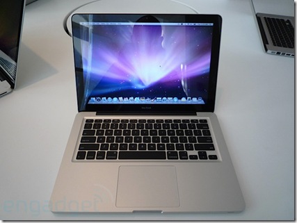
 apple-new-macbook-hands-on-top

That’s the new Macbook on top (via Engadget).

We still have the old one around, for the reduced priced of $999 ( or £719).

I’m wondering how much of a price difference there is between this one ( the $999/£719) and your Typical Dell.

13” Macbook (£719- base):

  • 2.1GHz
  • Intel Core 2 Duo
  • 1GB DDR2 Memory
  • 120GB hard drive1
  • Intel GMA X3100 graphics

The Dell Inspiron 1525 from dell.co.uk (£399 – no customisations):

  • Intel® Pentium Dual Core Processor T3200 (2.0 GHz, 667 MHz FSB, 1 MB L2 cache)
  • 15.4" Wide Screen WXGA (1280 x 800) Display with TrueLife™
  • Integrated Intel® Graphic Media Accelerator X3100
  • 2048MB 667MHz Dual Channel DDR2 SDRAM [2×1024]
  • 250GB (5400RPM) SATA Hard Drive

Ok. Here is the same 2.0 GHz Inspiron 1525 from Dell.com ($699):

  • Intel® Core™ 2 Duo T5800 (2.0GHz/800Mhz FSB/2MB cache)
  • Glossy, widescreen 15.4 inch display (1280×800)
  • 3GB2 Shared Dual Channel DDR2 at 667MHz
  • Size: 320GB3 SATA Hard Drive (5400RPM)
  • Intel Graphics Media Accelerator X3100

That’s a £310/$200 difference in price.

Of course such a comparison doesn’t take into account the MacBooks multi-Touch trackpad or Apple’s legendary Customer Service ( Dell Uk is good, too), or Vista Media Centre that is bundled With Vista Home Premium, or Dell’s cheap colour upgrade.

There’s a gap. But is it Worth It?

A Word of Caution

Since the quake in California,  old Vimeo and Youtube videos that people have favourite have been showing up in FriendFeed. Current thinking has it that the data must have been destroyed and recreated from backups.

Some of them are, NSFW, shall we say (I’m putting it very, very delicately). There is even one particular user that has a lot of these videos showing up in his stream (and I’m not linking to them – I’m keeping this blog respectable).

So given the current employers habit of Googling prospective hires, it might be safer to be careful what we add to our online personas.

Just saying.

Google’s Chrome

Google today launched a new browser, called Chrome.

And you can get it from www.google.com/chrome

Its lightweight, refreshing and has a few nice features I’ve been looking for Mozilla to implement in FF. Namely that you can move tabs between windows. And it has a spellchecker built in (I’m too lazy to install THAT FF plugin). And a privacy mode ( why on earth one would want to use it is beyond me). And its based on Webkit, like Safari.

Some screenshots:

chrome 1 

chrome 2

chrome 3

Now thats as far as I’ve got with using the new browser.

Its already good enough for me to consider making it my default browser.

The Friendfeed bookmarklet works (although it detects that I’m using Safari).

There is no Delicious plugin yet (critical to me I can’t imagine not having it).

And Firebug would be nice as well – it would make developing with yet another browser slightly easier.

Robert Scoble has reported over on friendfeed that Google properties appear to be faster on Chrome ( not sure abut that yet).

And Yuvi, of statbot.com, reports that some Sliverlight apps load, but the heavy ones hang.

I’m betting that Microsoft offices are a touch louder than usual.

Lets see what happens here.